When writing and publishing, the goal for most authors isn’t to toss words onto the page, then sit back and wait for someone to pay for the privilege of reading their literary brilliance. A lot of hard work goes into getting all the pieces of the book production process just right in the hope of converting readers to fans.
That’s why style matters. Tropes aren’t the only expectation readers have when it comes to genre; they also have style expectations for things like body text and book cover or title fonts. And whether it’s the classic elegance of serif fonts or the modern simplicity of sans serif, choosing the right font can significantly impact readability and overall aesthetic appeal. For body text, serif fonts like Times New Roman or Garamond are commonly preferred for their readability in print and the way the serifs guide the reader’s eyes along the text. Sans serif fonts like Arial or Helvetica, on the other hand, are popular in digital formats because of their clean and modern appearance.
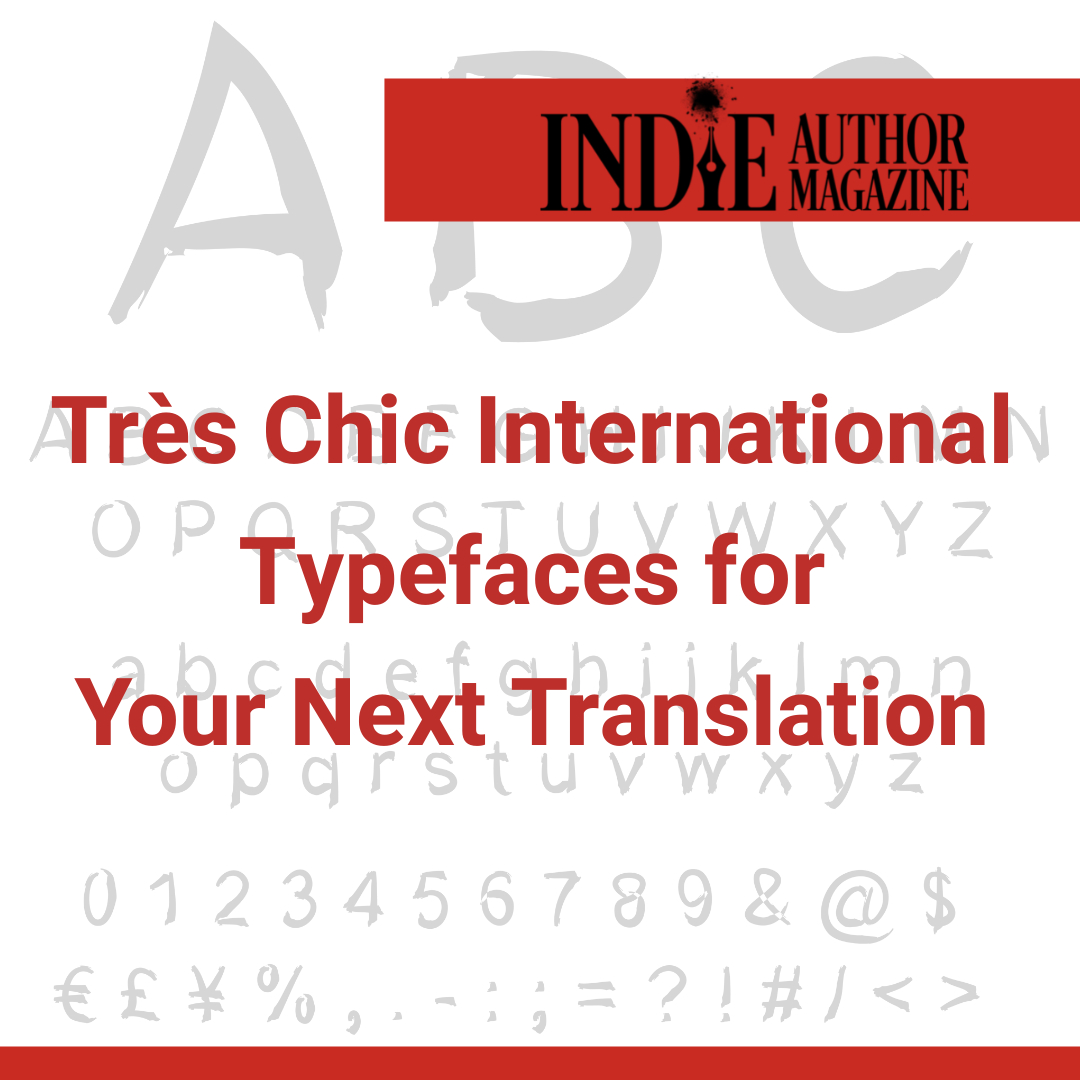
Beyond aesthetics and readability, however, when planning for translations, authors and designers need to consider the linguistic nuances of different languages. Certain characters, such as ü, ñ, or é, may be integral to conveying meaning accurately in translated works. Choosing fonts with comprehensive language support ensures that all text, including special characters, remains clear and legible across different language editions.
While it’s always a good idea for an author to exercise a certain level of creative control over their end product, approaching a translation project by working with a designer can provide access to a wider array of tools and licensed fonts, resulting in significant cost and time savings. Although companies like Google Fonts offer all their fonts as free, open-source tools, and have even started to integrate into formatting platforms like Atticus, many companies who offer specialized fonts require the purchase of a commercial license if a user wishes to produce content to be sold.
When choosing a font, another important point to consider is how the reader will consume the content. While monospaced fonts like Courier or Menlo work well with print formats, they are designed to maintain a consistent amount of space between characters and don’t resize well on most mobile and e-reading devices or applications. Reflowable fonts such as Georgia are better suited for e-book formats like EPUB because they allow the reader to customize things like font size and line spacing based on screen size and personal preference.
Whether you’re working with a designer or selecting fonts for your book yourself, for those seeking accessible and budget-friendly font solutions, several tools offer a diverse range of typefaces to suit every project.
https://dafont.com allows users to download various free fonts in English and several international languages. Downloads are available for either Windows or Mac operating systems.
https://myfonts.com is a subscription site but allows free access to a fantastic knowledge base. Click on the arrow next to the Learn option in the top menu bar to display a dropdown menu of free content.
https://fontjoy.com is a free, AI-based tool that guides authors in pairing fonts that work well together across the various design elements within a book.
Additionally, here are five free fonts suitable for a range of genres and international languages. The fonts listed below would work well as either titles or interior typefaces in your books.
Font Round-Up: International-Friendly Fonts
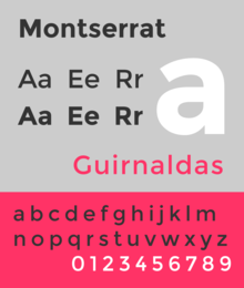
Montserrat
Type: Geometric sans serif
Use: Book covers or body text
Genres: Contemporary Fiction, Young Adult, Non-Fiction
Languages: Latin script languages, including English, Spanish, French, and German
Montserrat is a versatile and modern font with a geometric aesthetic. Its clean lines and wide range of weights make it suitable for various genres and design styles. Montserrat offers extensive language support, making it an excellent choice for authors with international audiences.
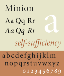
Minion Pro
Type: Serif
Use: Book covers, book titles, and body text
Genres: Historical Fiction, Mystery, Romance
Languages: Supports Latin script languages, including Vietnamese, as well as Greek, Armenian, and Cyrillic alphabets
Minion Pro is available in sixty-four styles encompassing a variety of weights, widths, and sizes. It sports a clean, neutral look that lends itself to a variety of uses.
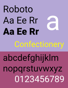
Roboto
Type: Sans serif
Use: On-screen text for e-books, newsletters, or websites
Genres: Science Fiction, Thriller, Self-Help
Languages: Supports Latin script languages, as well as Greek and Cyrillic alphabets
Roboto is a modern and versatile sans serif font developed by Google for its operating system. Its balanced proportions and clear letterforms make it suitable for a wide range of genres and design applications. Roboto ensures consistent readability across diverse language families.
Libre Baskerville
Type: Serif
Use: Body text
Genres: Literary Fiction, Poetry, Biography
Languages: Supports Latin script languages with extended character sets
Libre Baskerville is a modern interpretation of the classic Baskerville typeface. Its generous x-height and open counters enhance readability, making it an excellent choice for long-form text. It offers extensive language support for multilingual projects.
Nunito is a friendly and versatile sans serif font designed for optimal legibility across various platforms. Its rounded letterforms and generous spacing make it particularly suitable for children’s books and visually engaging content.
Choosing the right fonts for book design is a crucial factor in positioning yourself for success. By considering factors like readability, language support, and aesthetic appeal, authors can create visually captivating and accessible works that resonate with readers worldwide. With the plethora of free and commercially licensed font options available, authors now have the tools they need to bring their literary visions to life in print and digital formats for markets the world over.
Jenn Mitchell
Jennifer Mitchell
Start or Join a Conversation About This Article:
When Writing Means Business, Storytellers Read Indie Author Magazine
I’m still in the “side hustle” stage of my career, and I sometimes struggle with deciding whether larger costs—platform subscriptions, conference tickets, a specific editor or cover designer, ads—are a good investment or something that should wait until I’m earning more from my books. Any tips? Trying to Be a Smart Spender Dear Trying to Be a Smart Spender, Oh, darling Spender, managing your author finances is trickier than solving a Rubik’s Cube blindfolded! But
I keep hearing that I need to niche down into a genre to build a solid author brand, but I love writing multiple. Is it possible in our industry to build my brand around me and write what I want to write? Genre Wanderer Dear Genre Wanderer, My precious Wanderer, I feel your pain. Being fenced into one genre simply won’t do! That’s like being told you can only sip one type of tea for
I like to think I’ve conquered impostor syndrome, but any time I give interviews, reach out to someone with a research question, or try to set up local author events, I feel awkward and out of place. How do I confidently approach professionals outside the author community? Out of My Element Dear Out of My Element, My dear elemental friend, reaching beyond our cozy author circles can indeed feel as precarious as a hobbit venturing
We’ll send you our best articles, special offers, and industry updates
Would You Like a Free Issue?
Hello! I’m Indie Annie, and I would love to send you a copy of this month’s issue of Indie Author Magazine. Just join our email list and I’ll drop it in your inbox!