
Ad Graphics That Sell
Your novel debuts. The story is amazing. The cover is on trend. The product description is flawless. But not every author is going to find their audience from the moment they click the publish button. For those requiring the extra push to find readers, advertising might be a necessity. But what makes an ad capable of stopping doom scrollers? How can an author hedge their bets so an ad entices potential customers to not only click, but purchase? Sit down, strap in, and top off the coffee. This is a crash course in design for advertising.
More than Pretty Pictures
Good and bad are subjective terms with little meaning in design. Instead, graphic designers rely on elements (point, line, shape, form, value, and color) and principles (balance, contrast, emphasis, proportion, space, variety, and unity) as the litmus test for what is and is not working. In a television drama, a director knows even in an ensemble cast, it is important to give individual actors the chance to shine. But it’s their collective efforts that accumulate to create a memorable scene. Designers do the same, and by no means is this an easy task. Luckily, some of the best television is done when a single actor gives an outstanding performance. Let’s break down the most essential parts of an advert and see which actors we need to let shine.
The Stars of Our Show
Color
A study by Satyendra Singh suggests that upward of 90% of consumer judgments are based on color alone. This makes it one of the most important aspects of an advertisement. Authors who study their market understand that there is a link between color and genre, but this conditioning does not always translate into successful advertising. While a book cover might have similar shades of a single hue, the use of contrast will help a face, a spaceship, or a weapon to stand out.
Image: Example 1 - Contrast.pdf & Example 2 - Contrast.pdf
Image: Example 3 - Contrast.pdf & Example 4 - Contrast.pdf
Caption: Example one is lacking contrast, leaving the text fading into the background. Example two uses complementary colors (opposites on the color wheel) to push the text forward, making it readable even at a fast glance. The same can be seen when using imagery. Example three lacks contrast, and the viewer needs to squint to identify the objects. But example four leaves no question that you’re seeing an astronaut dabbing.
Robert Ryan, author of Author Unleashed says, “The human brain is wired to spot contrast and pay attention to it . . . It signals to the human brain that something is going on and needs further investigation.” But what is contrast? Dictionary.com defines it as “a striking exhibition of unlikeness.” This can be achieved by featuring colors on complementary colors (blue/orange, red/green, yellow/purple) which would allow blue text to stand out against an orange background. Another option is to adjust the value by pairing a soft, almost pastel purple, with a bold, rich yellow. The extreme would be using a monochromatic (one color) along with black and white which has the potential to be striking and highly visible. Another key aspect is creating aesthetically pleasing color schemes. Thankfully for those without an eye for design, Adobe created color.adobe.com to aid in this department.
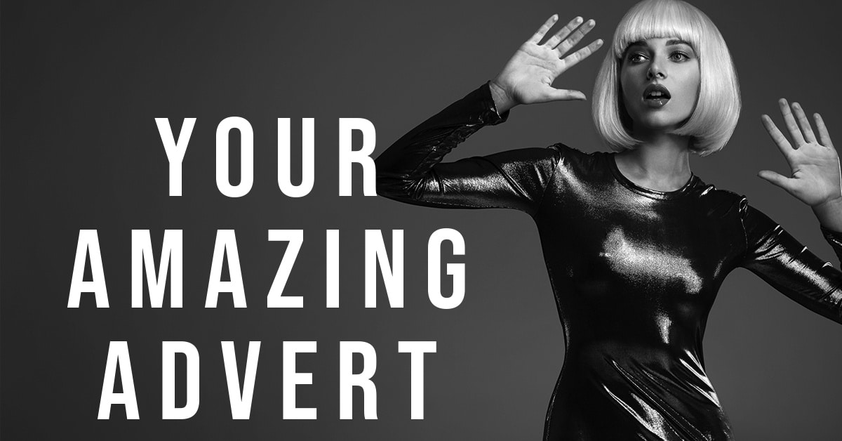
Fonts
Repeat this phrase, “Display fonts are my friend.” Originally meant for headlines in print ads, typographers design display fonts for legibility in short-form. They include thicker strokes, less clutter, and most importantly, pack a little visual oomph. Once upon a time, options were limited, but now there are hundreds, if not thousands, of display fonts for every situation.
Image: Example 5 - Contrast.pdf & Example 6 - Contrast.pdf
Caption: If you must use text on an ad, make sure you’re paying attention to how it interacts with the background. A thin stroke as seen in example five can sink into the background. Worse yet, over the model’s shirt, it’s nearly impossible to read. However, a font with a thicker stroke can stand out against an image and remain legible.
While this type of font promises the best visibility, there is still the question of style. Every font has a personality, and it’s easiest to boil them down into generic categories: fun, energetic, serious, heart-warming, etc. Don’t over analyze this, but it might be a good idea to ask your readers or a fellow author what “feelings” a font gives them. As long as it relates to your book and the brand, you’re heading in the right direction. See our article on Typography in our July issue for more details on the types of fonts.
Tone and Imagery
Ever see a preview for a movie and once you watch the movie, say, “This was nothing like the trailer.” We want to avoid that jarring sensation with potential readers. Just like your book cover relays the tone of the manuscript inside, so should the ad. Does the image relay the immediacy of your thriller? Is it as heart-felt as your rom-com? Is it as intense as your sci-fi?
Image: Example 7 - Contrast.pdf & Example 8 - Contrast.pdf
Caption: Example seven is light, coy, and even playful. Inside we could expect a rockstar heroine seeking love and fame. Example eight, however, has a more aggressive and wild tone to it. This book might contain a darker storyline with fierce magic and a heroine extracting her revenge. Both stunning, but each image sets a very different tone, one we expect to see when we crack open the pages of the book.
When it comes to imagery, focus on the tone. Yes, the content matters too, but the person scrolling doesn’t care if the image is a scene from your book. Hair color of the character? Nope. Setting from your book? Nope. But do make sure that your genre and subgenre are easily recognizable to readers. Beyond that, the connection to the actual book is unnecessary and potentially a detriment as suitable images will become limited.
The Crew Behind the Show
Wrangling the Text
While Facebook has relaxed their rules about text in ads, they still suggest ads that contain less than 20% of text. Ryan states, “Facebook is the best expert on Facebook ads – and the ‘Limited Text’ concept comes from them. They have billions of data points on how people use their platform, and that informs their rules and advice.”
But what about using your cover, which contains more text, as the graphic for your ad? Using your cover as-is simply won’t work because of the difference in aspect ratio. Your book is a vertical image whereas most advertising platforms feature a square or landscape asset. However, if you reformat the image, perhaps featuring your 3D book image on the left side of the ad, the consensus is split on the effectiveness. Unfortunately, there is no absolute yes or no. This will require each author to test their imagery to determine the best results.
Store Logos and Pricing
When getting down to the specifics of the imagery itself, testing is required. However, tips like Ryan’s “Keep it simple,” often resonate. If including the logo of a particular storefront, is it bogging down the advert? Perhaps rely on the ad copy to elaborate and not the imagery. Another trick explored by authors that has seen an increase in conversions, has been removing the $ or ¢ when advertising a .99 deal.
Wrapping-Up with Craft Services
The elements and principles of design are extensive, and can be overwhelming, but if an author only considers two or three of them (with a mind toward color and contrast), they will set themselves up for success. While a design project does not need to contain all of the different elements—this is lofty even for designers—they should each be considered, evaluated, and prioritized. The more of these checked off the list, the closer an author will be to having a striking ad. Just remember, much like a soap opera, we pause for the beautiful, but we stay for the bold.
Jeremy Flagg
Resources for Learning Basic Design
https://www.amazon.com/Elements-Graphic-Design-Second/dp/1581157622https://www.amazon.com/Graphic-Design-Handbook-Radu-Frasie-ebook/dp/B074161CJGhttps://www.amazon.com/Non-Designers-Design-Book-Non-Designers-ebook/dp/B00PWDFWEE
Resources for Color
https://color.adobe.com/explorehttps://99designs.com/blog/tips/colors-marketing-advertising/https://blog.wishpond.com/post/66197931282/the-psychology-behind-a-successful-facebook-ad-part-1
Resources for Fonts
https://fonts.google.com (Free)
https://www.myfonts.com/display-fontshttps://www.begindot.com/best-fonts-for-social-media/
Facebook Guidelines
General: https://www.facebook.com/policies/ads/
Text: https://www.facebook.com/business/help/388369961318508
Facebook Group