

I want to recognize a brand without being able to predict its next sentence.
That distinction has been on my mind while working on our publishing workflows. A useful voice guide should help an article, an email and a social post feel as though they belong to the same publication. It shouldn’t make them sound like three copies of the same assignment.
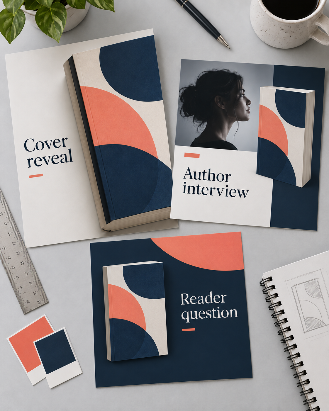
For an indie author, this comes up quickly. You might have a cover reveal, a conversation with readers about a character, and a practical note about where to find the audiobook. They can all sound like you. They also have different jobs. A cover reveal needs room for the cover. A character post needs something worth discussing. The audiobook note needs a link people can find.
If the guide requires every post to begin with a question, follow the same rhythm and end with a lesson, you’ll see the pattern before long. So will your readers. Changing the background color won’t do much to disguise it.
Keep the decisions that matter
The parts I want to keep are the ones that help us make a decision. At IAM, for example, we treat vendors as business partners and readers as fellow working authors. We can explain what a service does and where it might fit without inventing a fight with another service. We can discuss AI without deciding for every author whether they should use it.
Those are editorial commitments. They leave room for an interview to sound different from a software explanation. They also give someone drafting for us a way to judge an angle before writing a page of perfectly grammatical nonsense.
For your own author brand, a useful commitment might be that public posts don’t spoil the current book, or that the humor stays affectionate even when the protagonist is a menace. An example from your actual writing will explain that better than a long list of adjectives.
Give each piece enough material
A voice guide can’t supply a scene it hasn’t seen. When you’re preparing social content from a book, include the excerpts you’re comfortable sharing, the character details that matter, and any boundaries around spoilers. Otherwise, you’re asking whoever writes the post—human or AI—to keep finding new ways to describe the blurb.
Then choose what the reader gets from this particular piece. A diagram could make a confusing process easier to follow. A carousel could walk through a decision. A short video could show something happening that a still image can’t. Sometimes the cover really is the whole point, and it should be allowed to take up the space.
I’m also looking at the calendar as a whole. Several posts can come from one good article or one memorable scene, provided they offer different ways into it and aren’t all scheduled together. That gives evergreen work a longer life without making every day a rerun.
When I review a batch, I want to be able to answer two questions: would our readers understand why we made this, and does it sound like someone here meant it? A tidy grid is pleasant. I’d rather have a feed that gives people a reason to keep reading.
Chelle Honiker